Centralizing the patient journey across 6+ units, reducing cognitive effort in critical moments.
Architecture robust for multiple units, simple enough for stressed users.
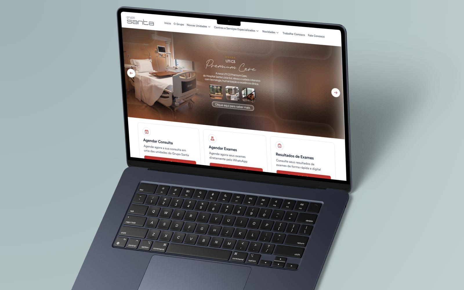
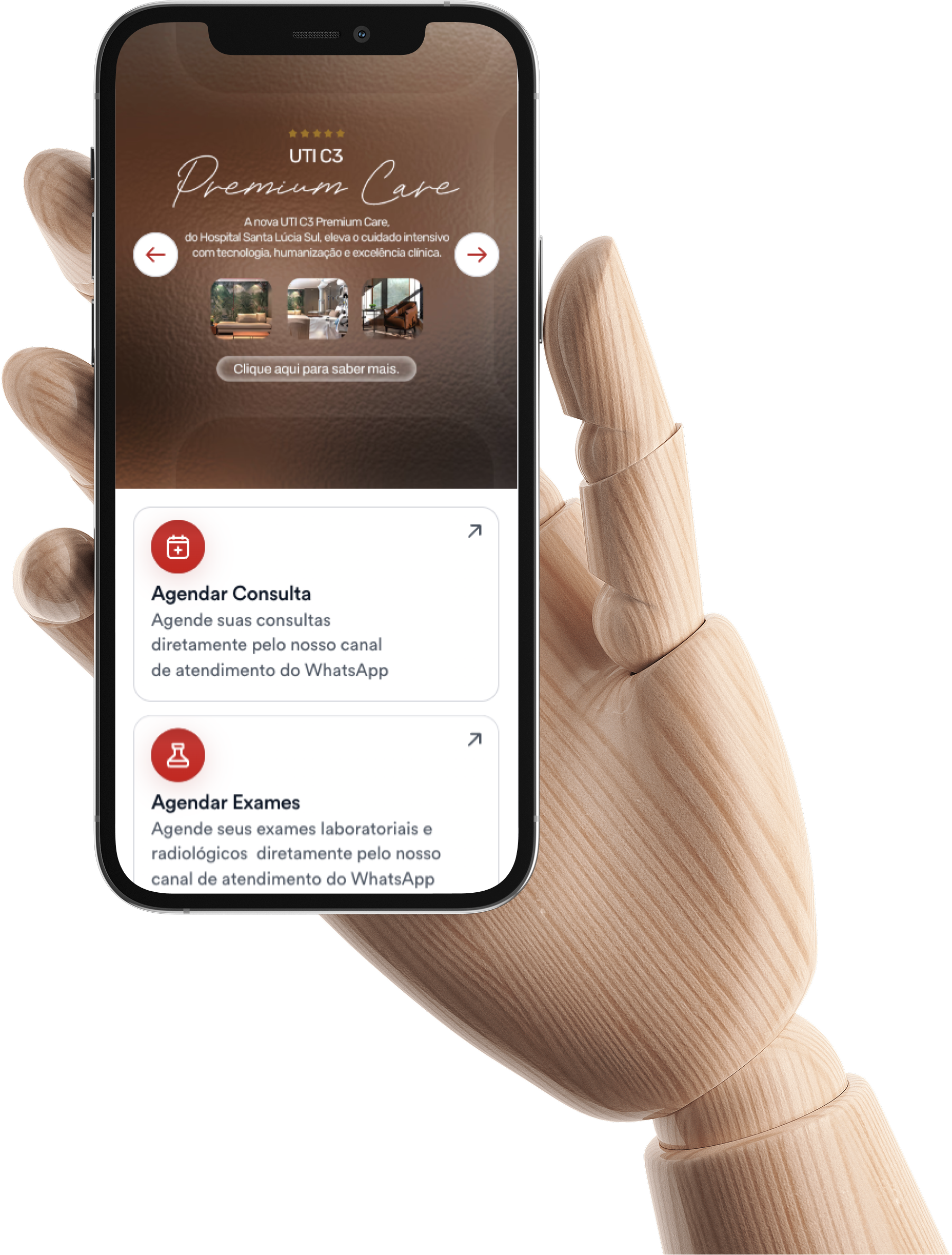
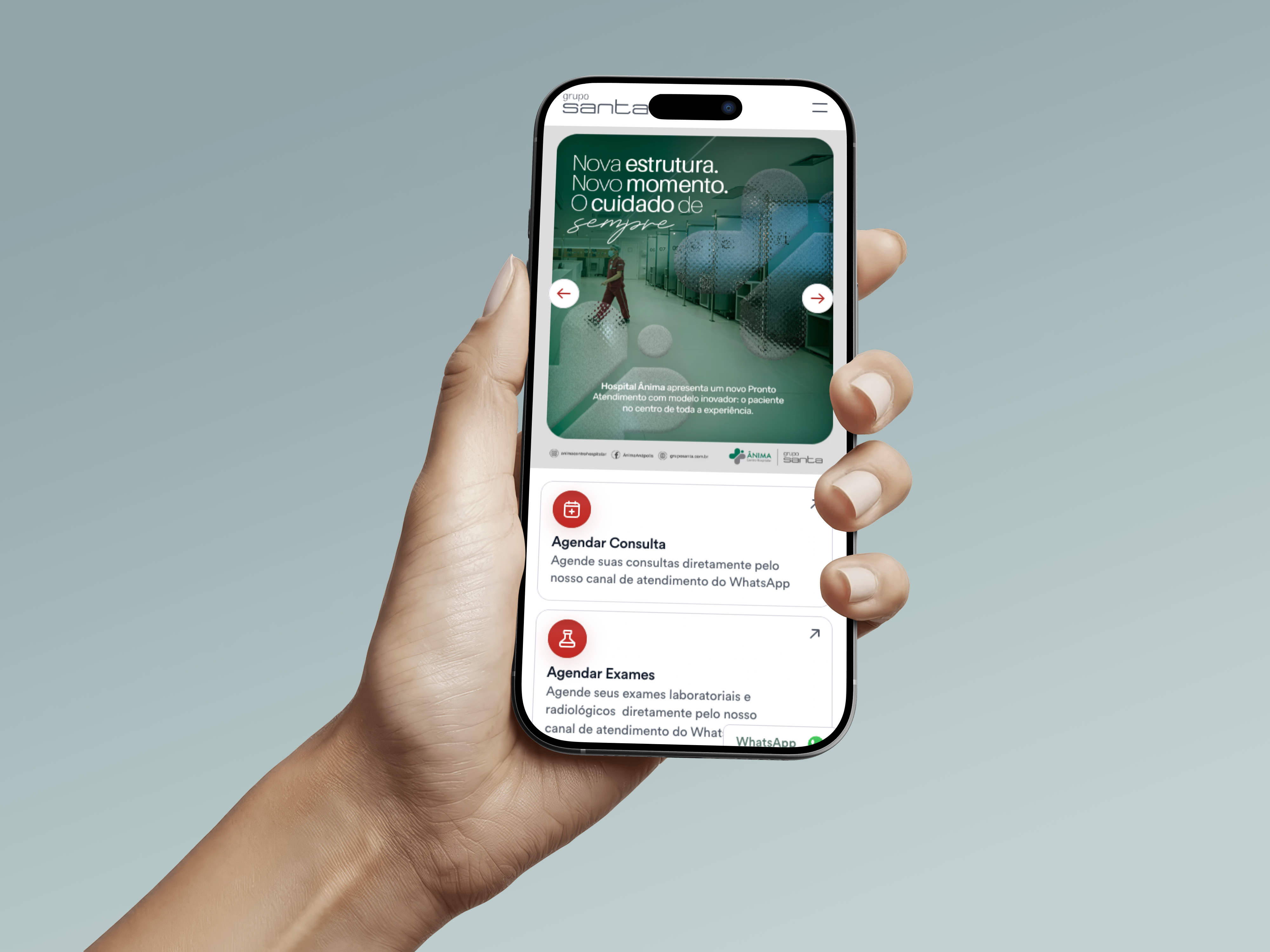
Three action cards for frequent tasks.
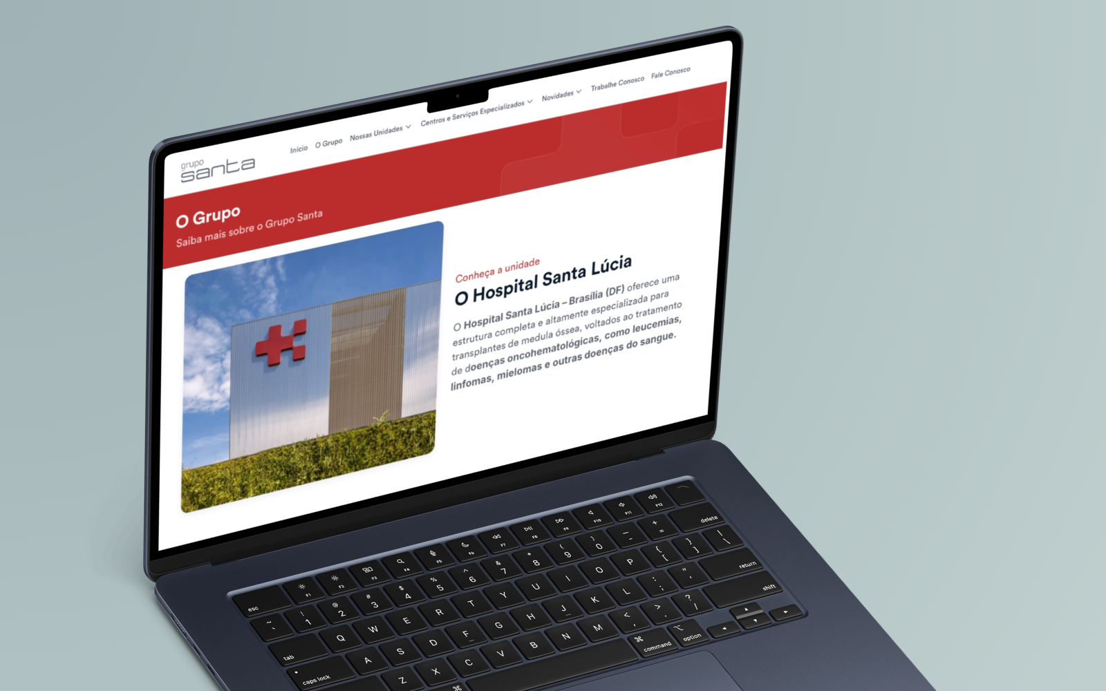
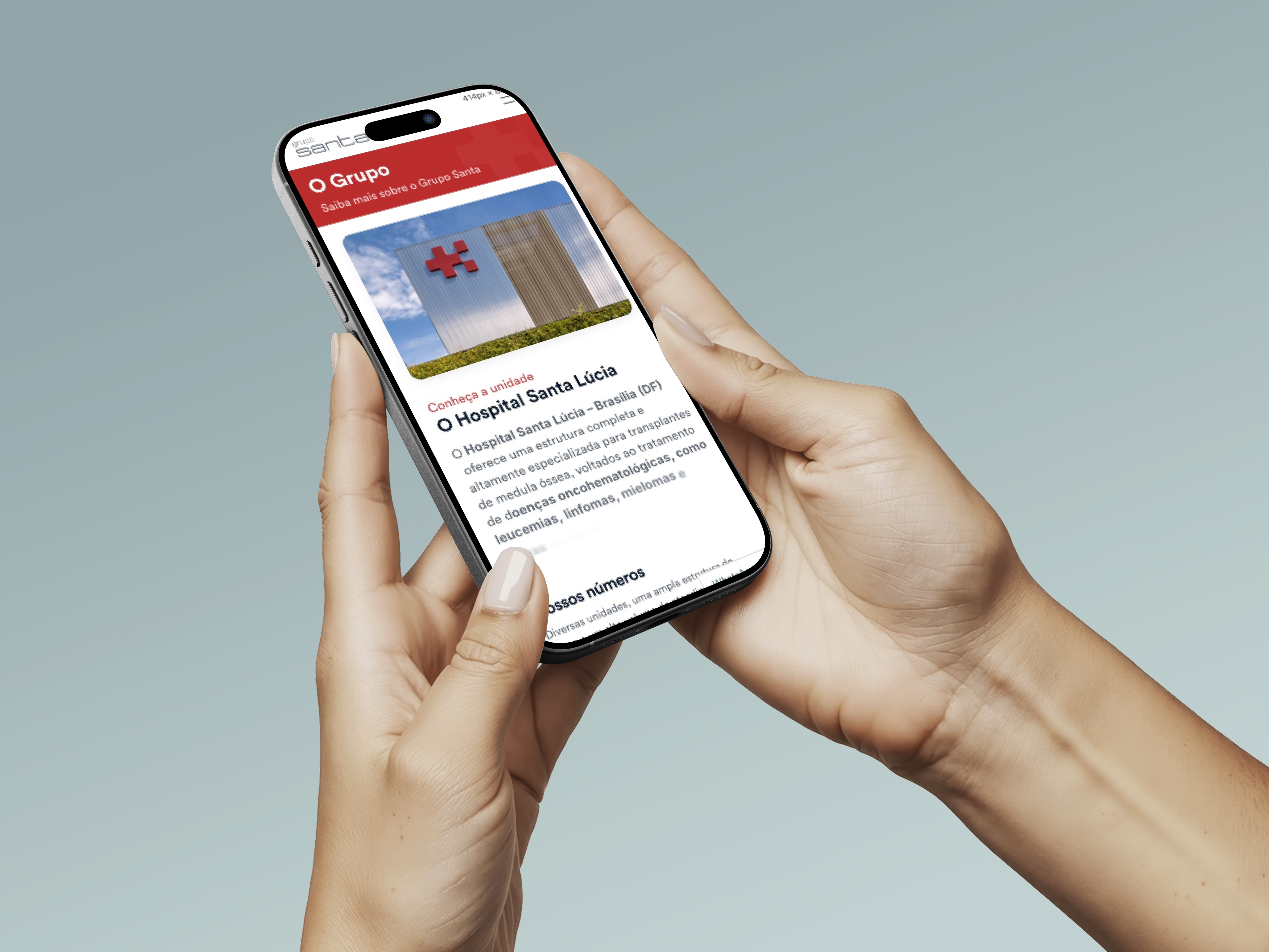
Scale, history, and Mayo Clinic partnership.
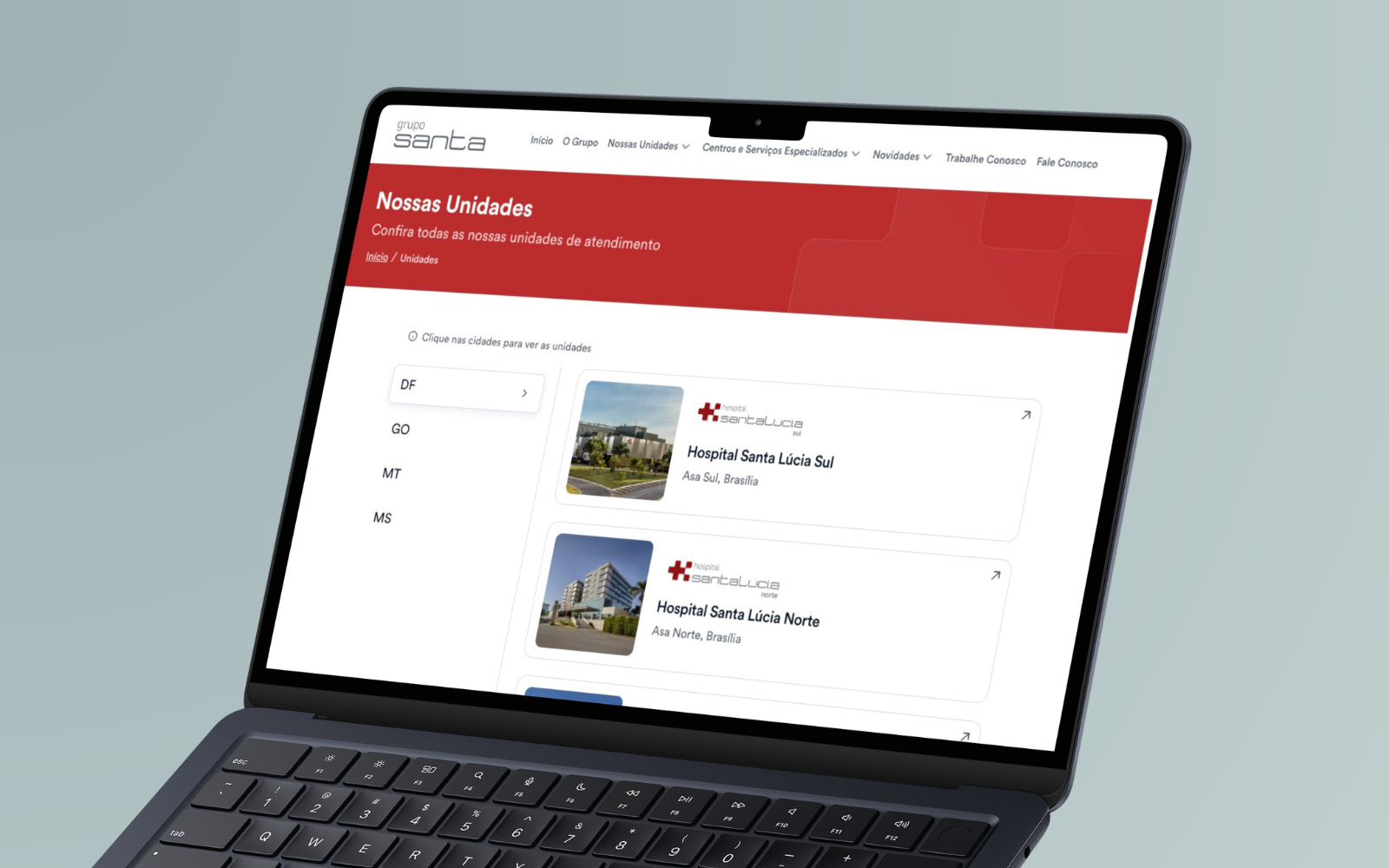
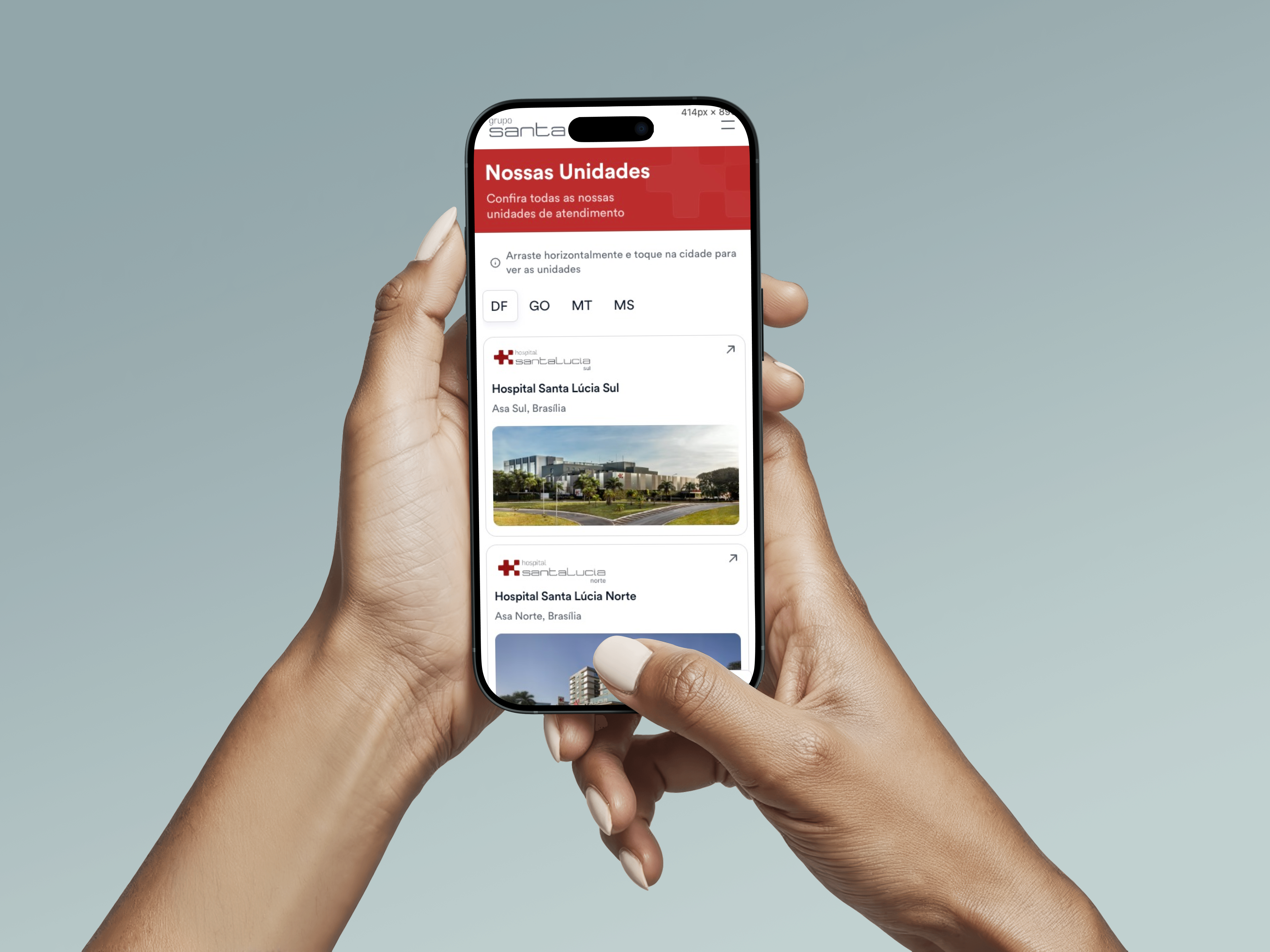
Map with filterable list, four states.
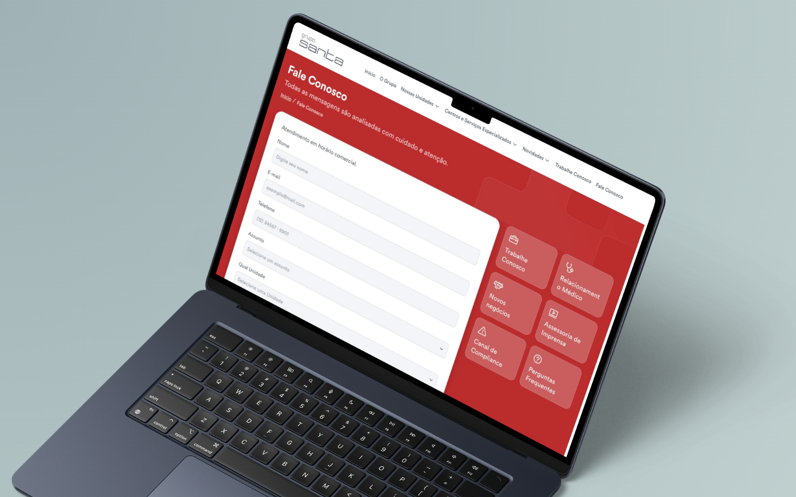
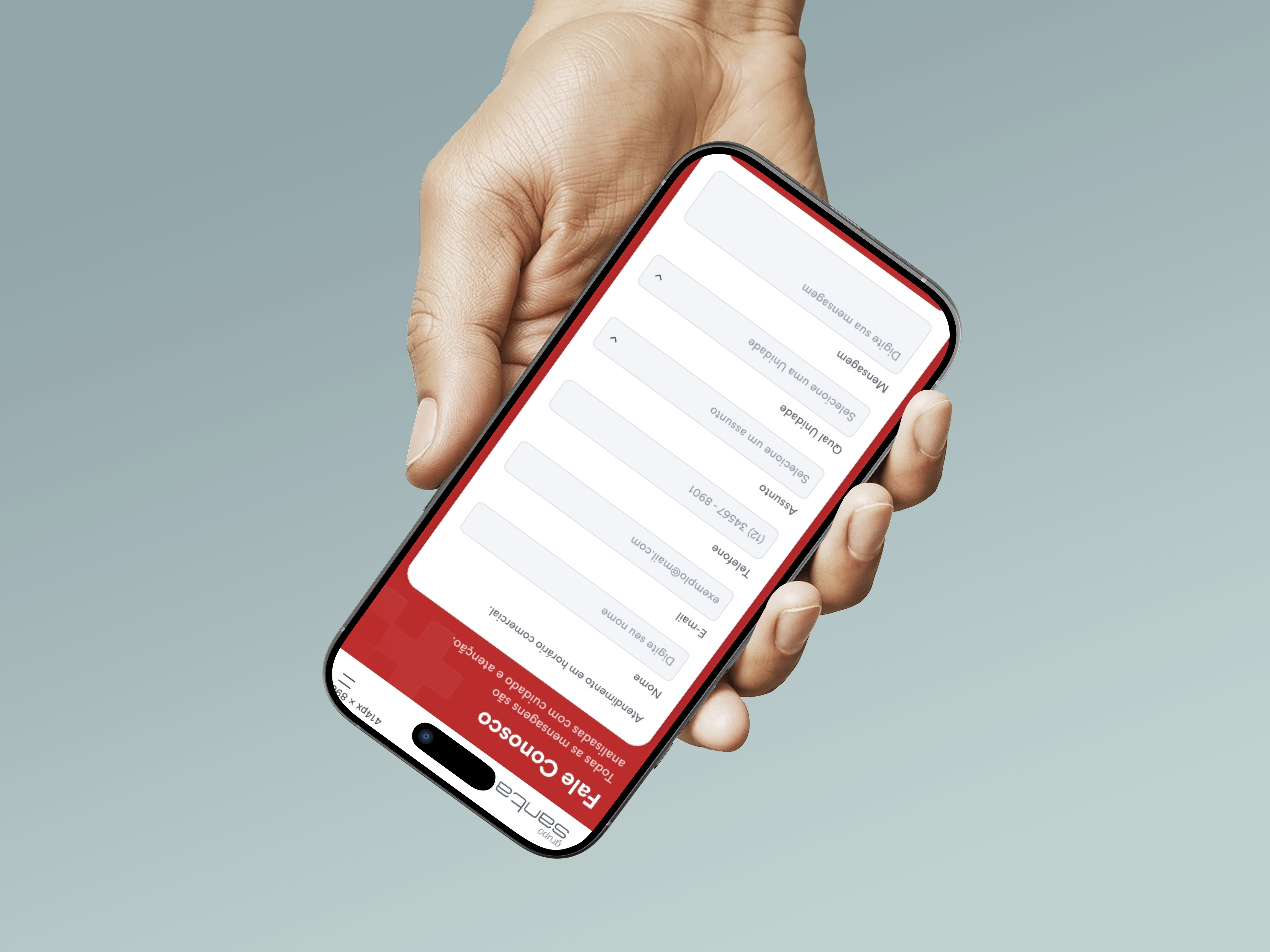
Clear paths for scheduling.
An experience designed for those who care.
Quick Actions first. Fewest interactions to destination.
Modular system for expansion without new design cycles.
Red dosed for authority, balanced with generous whitespace.
Validated for elderly patients, a retention pillar.
Users don't browse, they search. Emergency always one tap away.